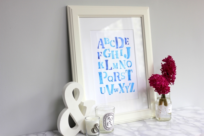
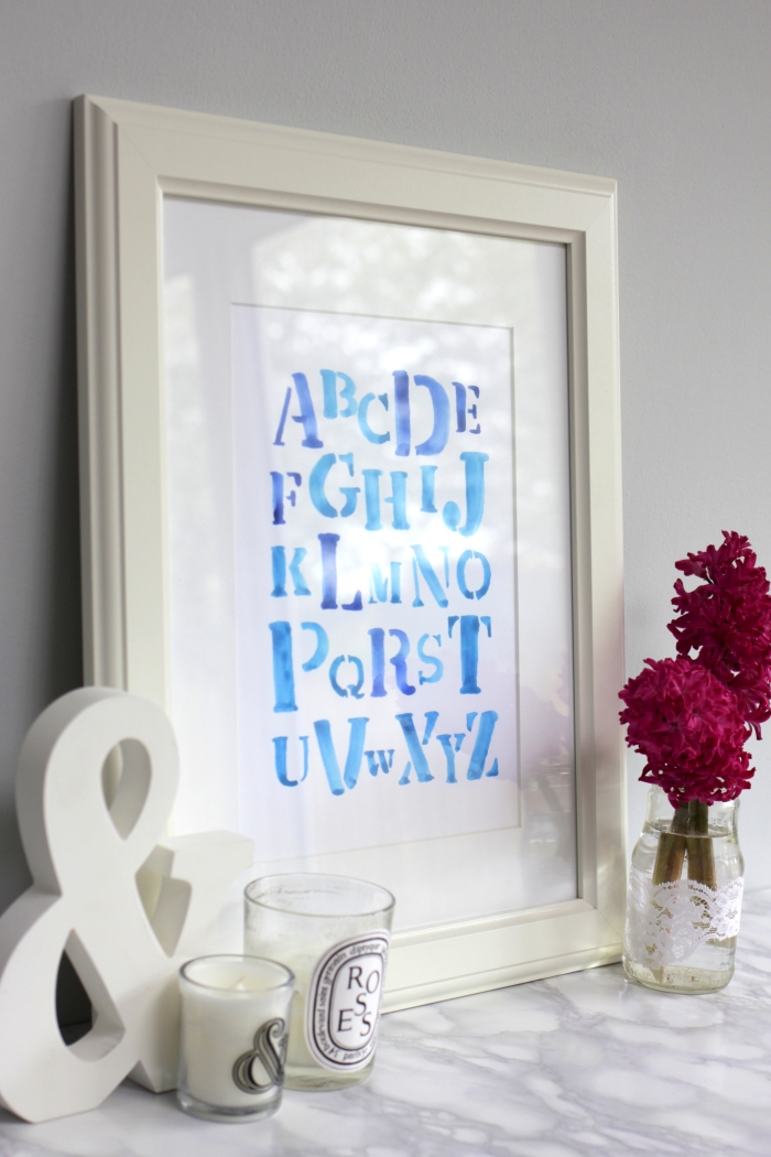
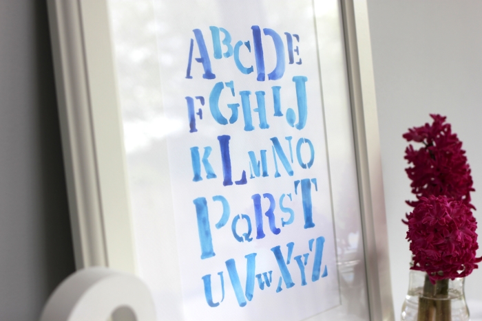
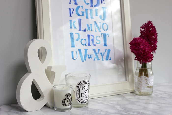
DIY: WATERCOLOUR ALPHABET NURSERY WALL ART
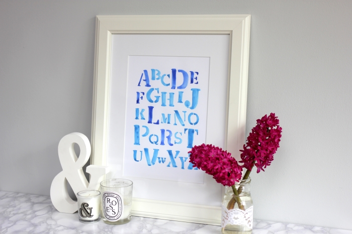
Before anyone gets too excited, no, I am NOT pregnant. This is an alphabet nursery wall art that I made for a friend’s baby boy whom we met for the first time today.
Watercolour and calligraphy, aka my current obsessions, have made a massive comeback recently. Beautiful wedding invite suites and wall art keep popping up on Instagram and the likes of Not On The High Street and Etsy.
I’ve been having so much fun practising traditional copperplate calligraphy since attending Gemma’s amazing workshop a few weeks ago, but I also really wanna try my hand (literally) at brush lettering and modern calligraphy!
Mr hubby very thoughtfully booked me in for both workshops with Quill London as my birthday present but they aren’t happening for a little while yet, so I decided to just give it a go having done some research on YouTube!
I’m by no means an expert - experts will laugh at my £6 children’s set from Ikea (bargain!) - but what I’ve found is that brush lettering with watercolour is not half as scary as it seemed. Watercolour is actually quite forgiving. If you’ve made a mistake, you can go over it quickly. If you’ve used too much pigment, you can just dilute it with a wet brush. And if it’s too watery, you can dab it with a bit of tissue and add more pigment.
Materials:
- Watercolour
- Round brush
- Watercolour paper
- Jar of (warm) water
- Pencil (optional)
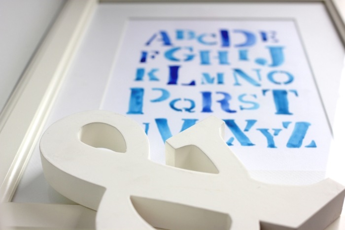
If you’re the carefree type, you can just go freehand, but I found it really useful to plan the layout in Powerpoint first. I chose the font “Stencil” and varied the font size to make it more interesting.
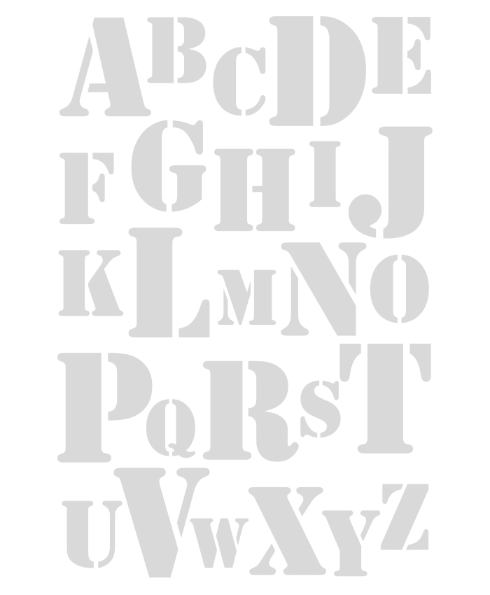
I then lightly marked around the outside of where the letters are going on the watercolour paper with a pencil. You can just do it by eye, but one trick I’ve always used is to lay the paper on top of the Powerpoint print out, and then flick the page up and down to help eyeball where the letters are going.
Once you’re ready, wet your brush and coat it in a colour of your choice. I’d recommend testing it on a bit of scrap paper to ensure you like the colour and consistency. And then… just go for it!
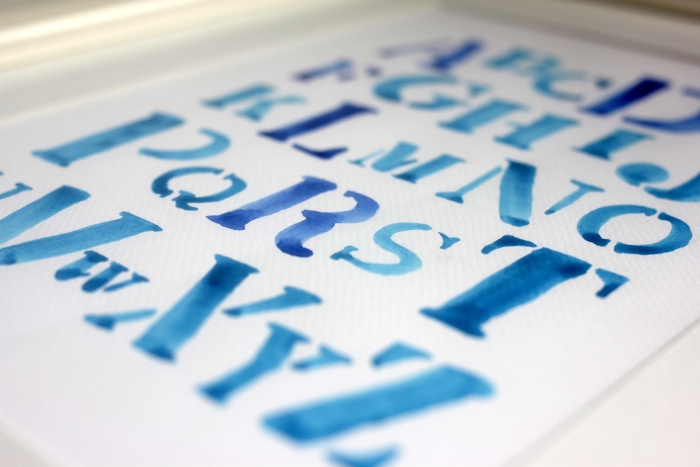
I don’t know if this is how the pros do it, but with the thin lines, I held the brush more vertically to use the tip, and with fatter lines, I held the brush almost horizontally / parallel to the paper.
Don’t worry if your strokes aren’t quite perfect. Mine certainly aren’t but I think that’s part of the charm!
Now, this isn’t a colour blind friendly question (as I found out from the hubs) but I’ve hidden the baby’s name in this… can you tell what it is?